Adobe Captivate
Team
2 designers, 1 design intern, 1 PM, 1 engineer
Duration
Mar 2016– Mar 2017
Company
Adobe
About Captivate
Captivate is an authoring tool for creating interactive e-learning content like simulations, compliance courses, etc. It has a loyal customer base because of its powerful features.
goal
As part of an engineering effort to upgrade the building platform, the design team was tasked with a proposal to upgrade the user experience.
My role
I led the re-design effort, initiating cross-functional collaboration, ideation and the final proposal.
A design driven process
Starting shaky
The design team had to make a strong case for restructuring a powerful and widely used product, to make it more user friendly. With every design decision, we had to ensure that it really was going to be a valuable change for our existing users, with minimum learning effort and increased ease of use. For this we stayed in touch with product evangelists at each phase.
Clarity in chaos
Absolute creative freedom sounds liberating, but too many unknowns meant we were creating our own working processes on the fly. The initial months were parallel efforts in understanding the complex product and thinking of improvements in the user experience. The skill I have picked up thanks to this phase, is the ability to set aside a designer's bias towards the unfriendliest of workflows and understand why it does work for our users despite the difficulty. Knowing this helps in using the successes of the product to our advantage.
An Adobe language
There are efforts within Adobe to make their products perceived by users as part of the same family. We stayed in touch with these teams, to keep updated and customise the common guiding principles to fit Captivate-specific use cases. Some use cases were unique only to Captivate because of the interactivity of its content.
Design Sprints
Once we had some base structure in place, we had to validate it by checking if existing features and tools function smoothly (or better) with it.
In our week–long design sprints we were creating a list of use cases on Monday, conceptualising, with some back and forth with both teams through the week and demoing these concepts and models for all the stake holders on Friday.
During Monday sessions we also created a platform to suggest new use cases. Friday feedback and discussions determined the closure or continuation of the sprint. We had 3 sprints for 3 features.
Users
Instructional Designers
are usually hired by a client or are part of a company's in–house team. They gather the knowledge to be shared and work with clients to structure it using either visual slides (Powerpoint) or text scripts of a lesson. Once approved, the lesson is created in Captivate visually and the interactivity and branching added. These users are Captivate's power users, who make up only 1-2% of the total Captivate users. They are also the early adopters of new features. Some of them are known to teach courses on how to use Captivate.
Subject Matter Expert (SME)
has expert knowledge in a particular field, who has either been asked by their employer to share it with co-workers, or do so as a personal teaching venture. These users could be from any career path – law, finance, sciences, arts, management, etc. The common factor is their familiarity with products such as Microsoft Powerpoint and Office. Despite this, SMEs may not necessarily be comfortable or up-to-date with technology. This group creates the largest chunk of Captivate users.
Educators
May use Captivate to create learning content so that it is accessible to remote students, however they favour products designed specifically for their needs, such Adobe Presenter Video Express.
The target user for Captivate Next was a subject matter expert who is a beginner to Captivate as well as e-learning.
Main Problem Areas
1. Clutter
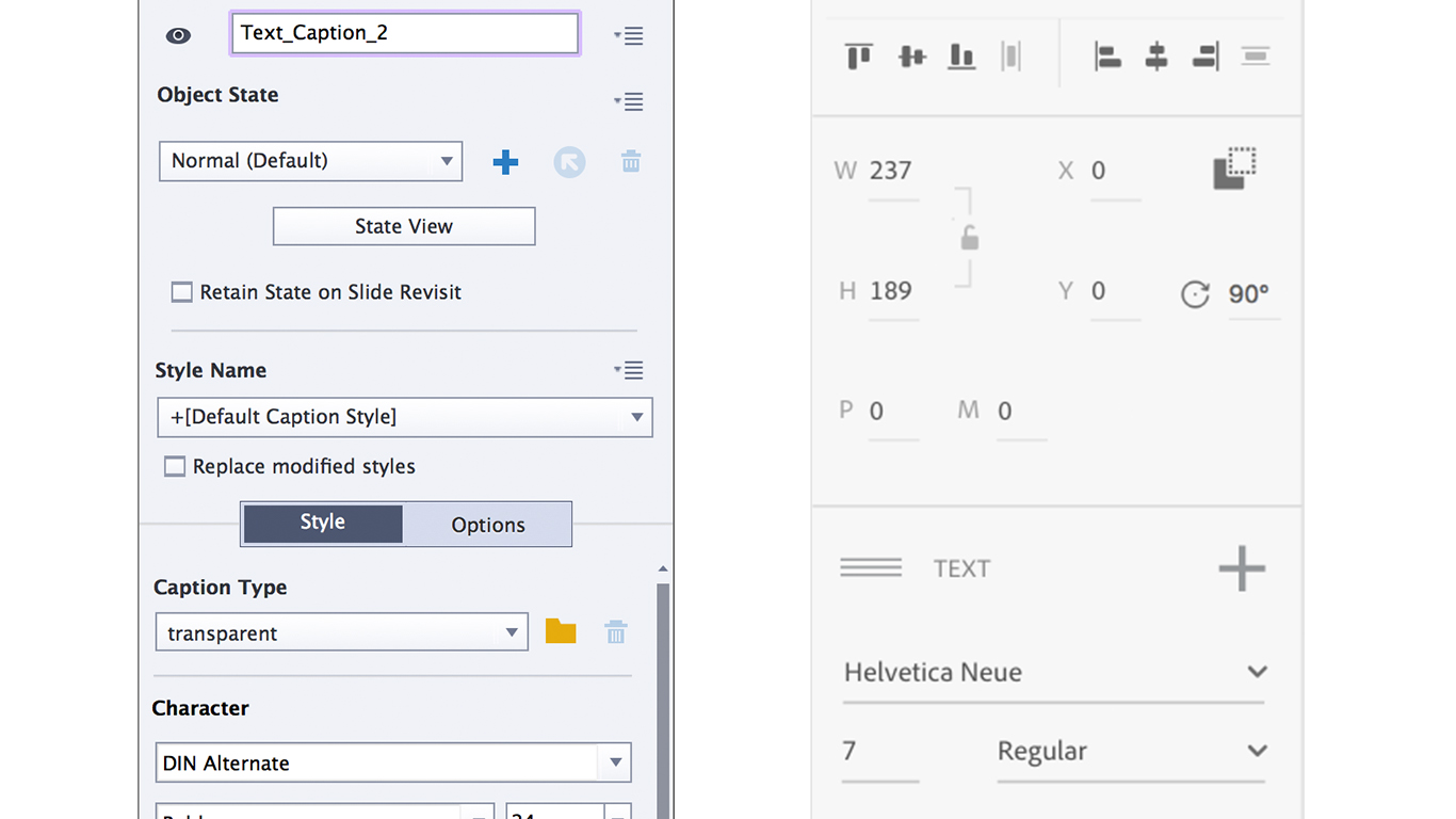
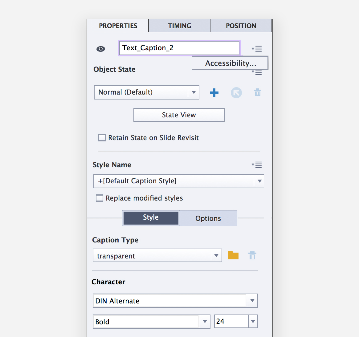
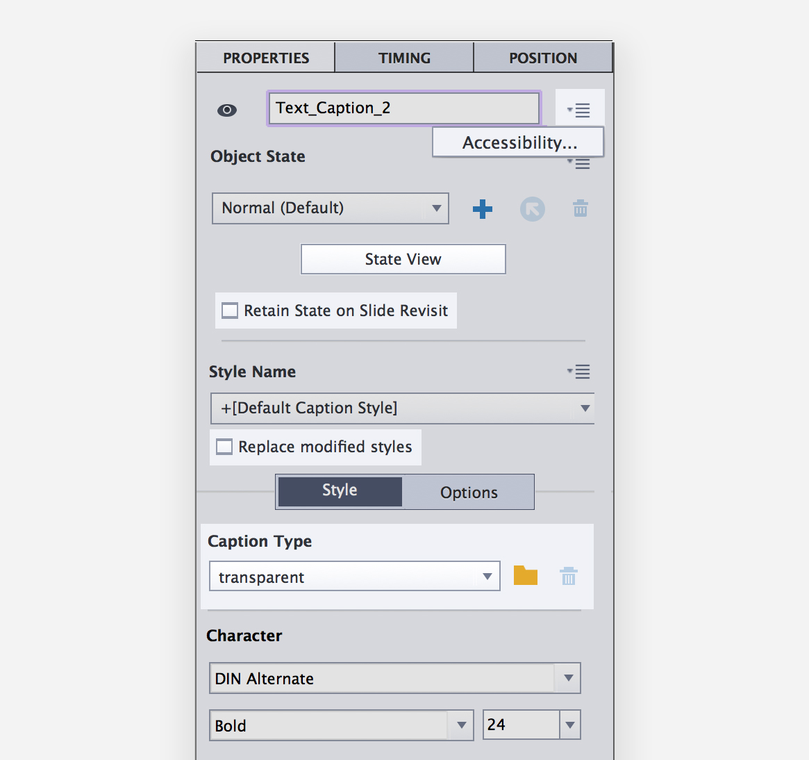
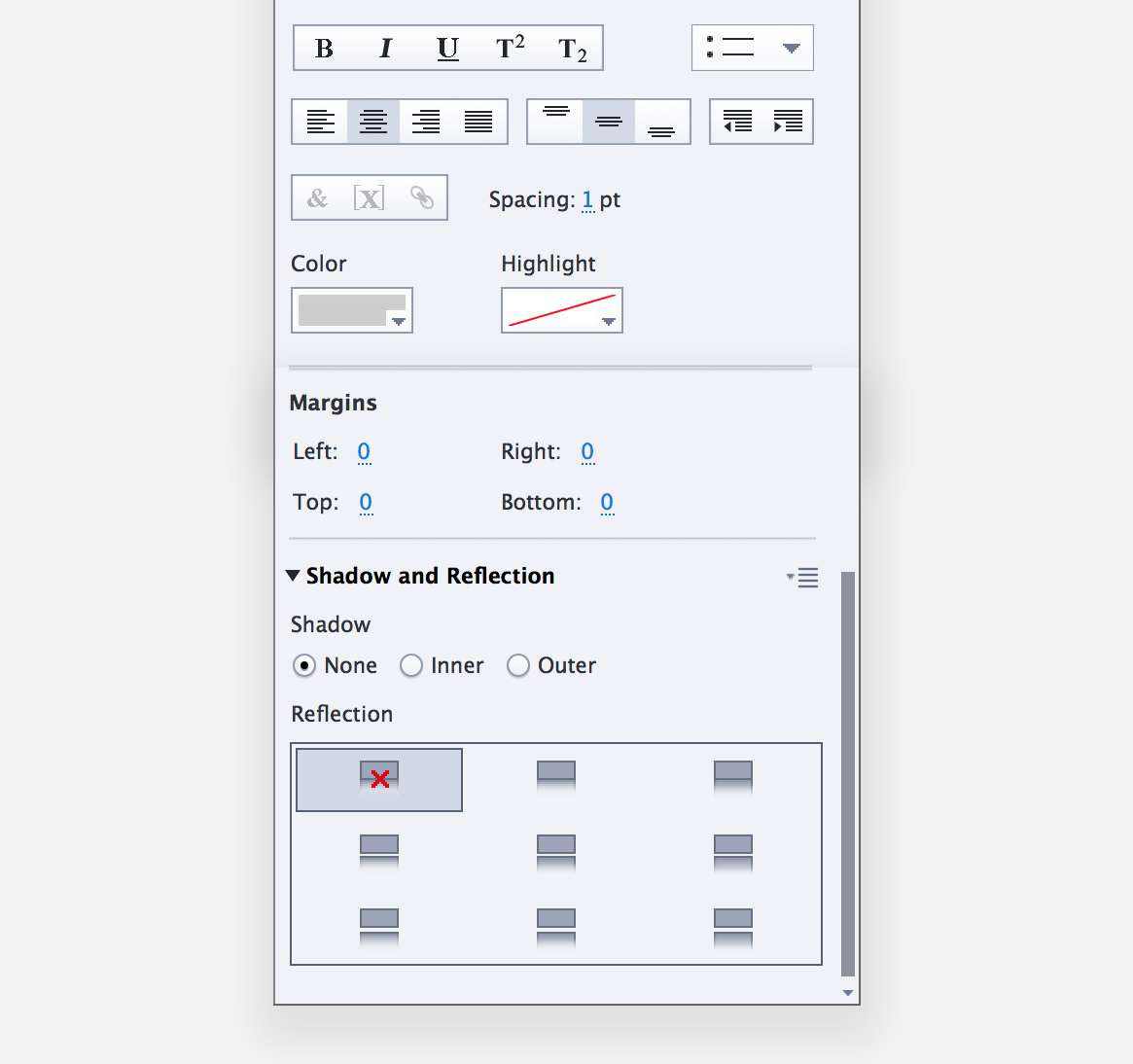
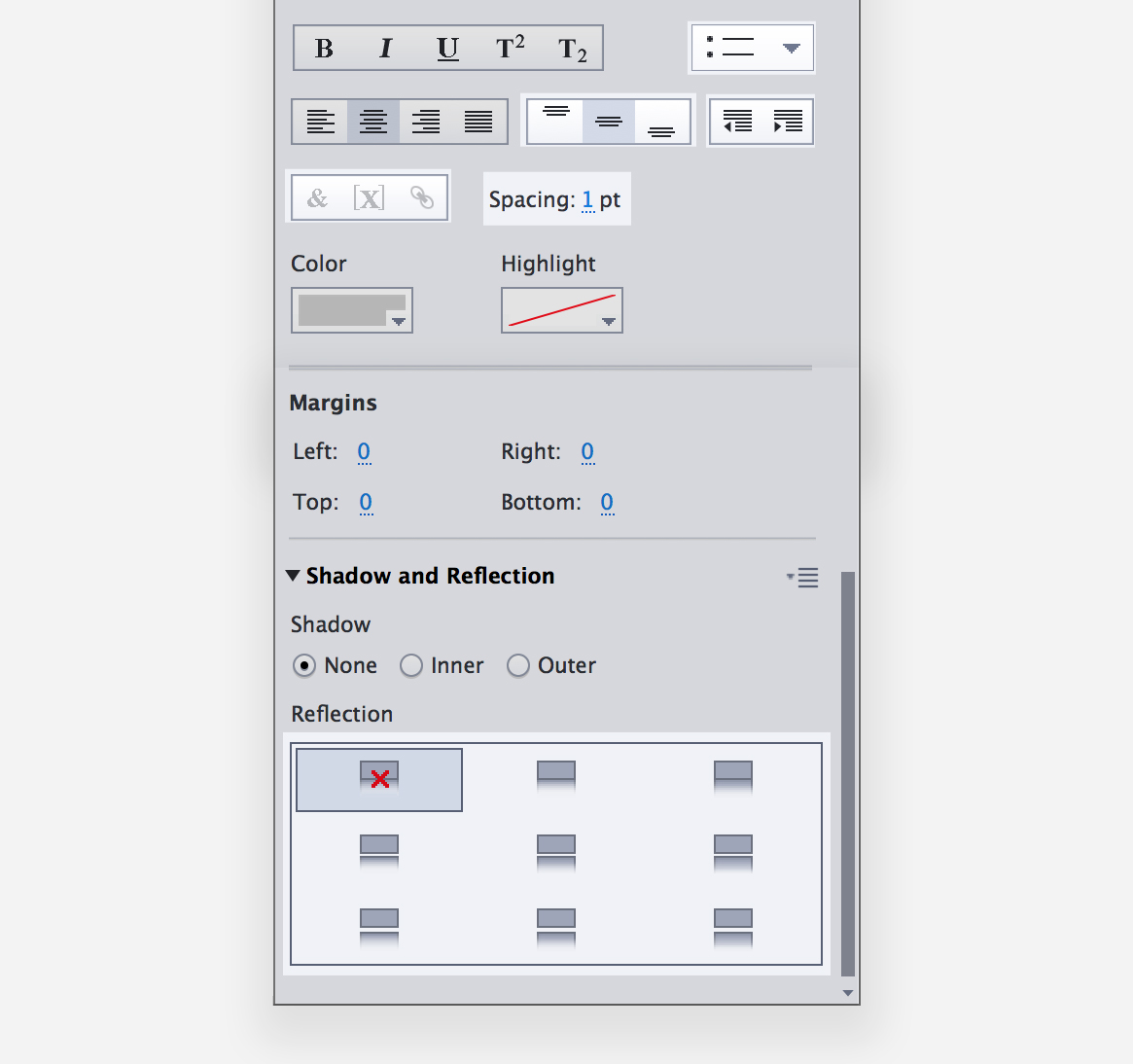
The interface is overwhelming at first glance, especially for a new user. The Properties Inspector panel is a good example of the information overload and visual clutter. Most properties displayed by default aren't used by beginner users, or even popularly by experts. This makes finding a property exhausting.
2. Information architecture
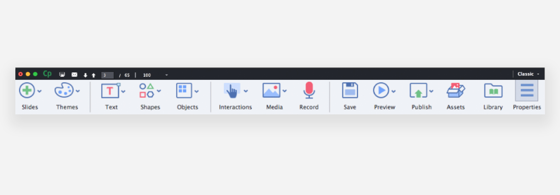
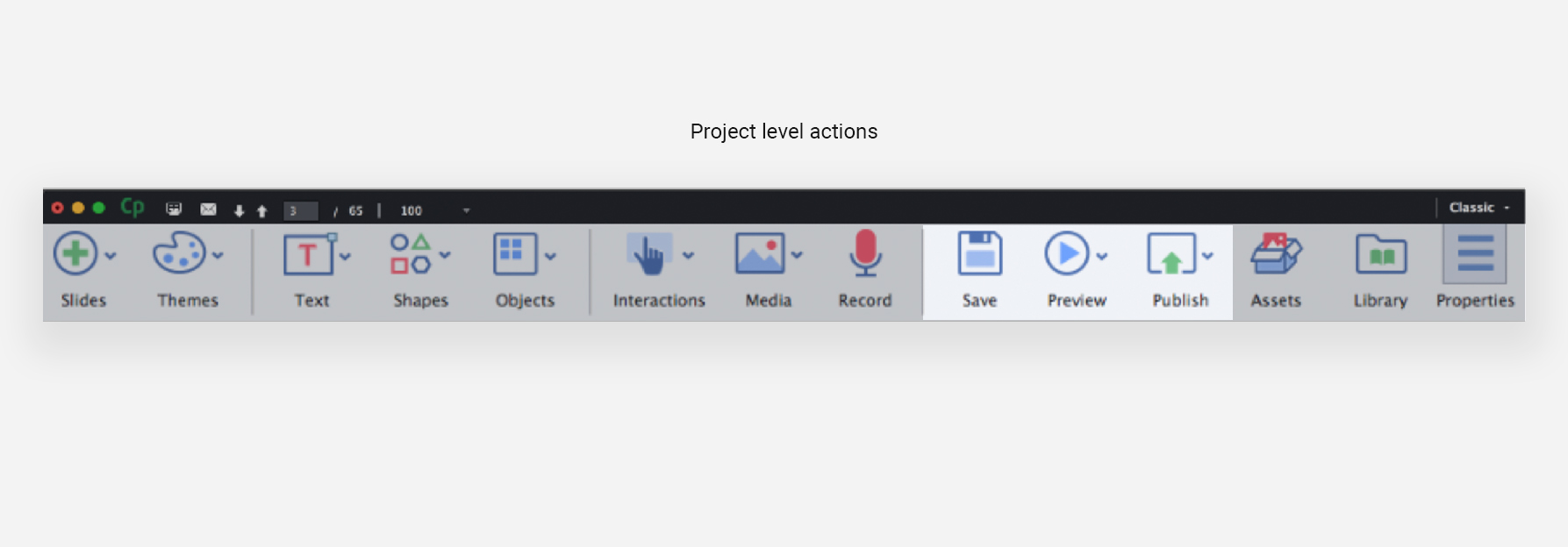
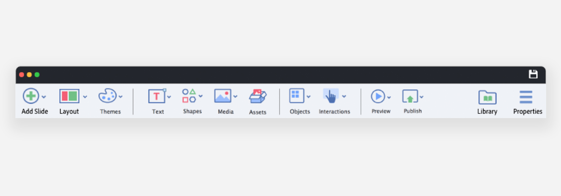
Features and tools are not easily discoverable because of visual clutter and the disjointed grouping of tools and actions. The primary navigation panel shown below illustrates the point fairly.
The primary navigation panel has disjointed arrangements of different tools and actions
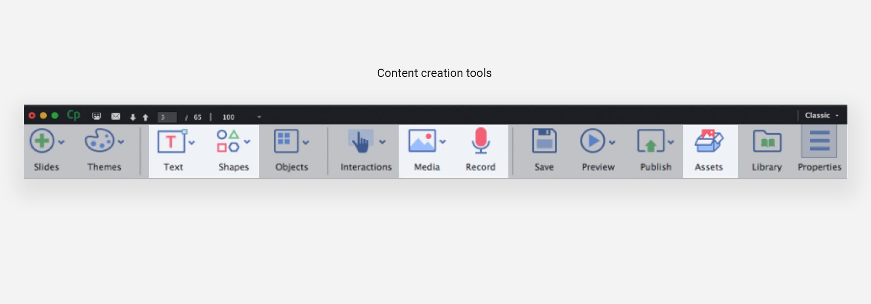
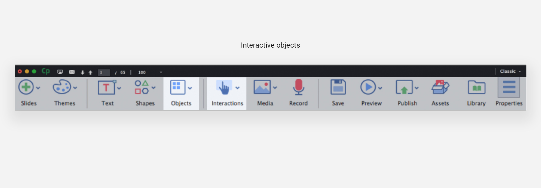
A recommended re-arrangement
3. Scope for productivity
Users who work for clients create course structures and plans on Powerpoint and text documents to get them approved, before starting work on Captivate. This task wastes time because everything outlined in the approved .pptx or .doc file needs to be recreated in a new Captivate file.
The only way to do so as of now, is to copy-paste and move between multiple windows. A couple of solutions for these include making powerpoint presentations editable in Captivate and help translate a plan created within Captivate into workable slides and screens right there.
4. Steep learning curve
During user interviews and online research in forums, we saw that most beginner users had to take courses on how to use Captivate. Granted, that the product has powerful features for which some learning is requiring, but it was evident that an overwhelming UI and lack of onboarding was making it hard to learn even the simpler workflows.
Foundational design principles
1. DISTINCTIVE SPACES
The first step to reducing clutter and increasing discoverability was to categorise different tools and actions based on the sequence they are used in. All creation tools and modules were grouped together on the left, canvas in the centre for basic authoring, and properties to the far right for advanced edits. This linear flow is finished with project level actions like preview and publish on the top right.
2. WORKSPACES AS SAFETY MEASURE
To ensure that the interface does not get cluttered with features int the future, we proposed workspaces as a safety measure. For example, if Captivate were to introduce tools to help the user collaborate with stakeholders within the app, they would be placed in a dedicated workspace with only collaboration tools and properties available in it.
3. Beginner success (without ignoring the expert user)
We proposed various methods to increase beginner success for features without hindering the expert users. These include – shipping a variety of defaults, presets and highlighted popular tools; promoting direct manipulation instead of asking for numerical values; accommodating space in the workflows to add learning aids for beginner users; and finally, an onboarding system to help users with new features.
Learnings
Creating a custom work process in collaboration with different stakeholders was a new experience.
How to drive a small design team, figuring out strengths of team members and distributing tasks.
This project gave me chance to sit at the table with the decision–making stake holders to recommend for and against strategic decisions that help or hinder the user, respectively.
Learning that for some teams it helps to foresee possible business goals and have multiple approaches and solutions thought of. A decision that worked well for us was recommending 3 different ways of approaching the experience redesign– from least to most amount of new learning for a loyal user and from least to most amount of development effort for the engineering team.

