Outlook Calendar on mobile web
TEAM
3 designers, 1 PM, 5 engineers
DURATION
Dec 2019–Jan 2020
Company
Microsoft
About calendar
Outlook’s calendar is used widely by enterprise users to track their meetings. It had a basic ‘Day view’ to check meetings and a detailed event creation form. On the mobile web, the monthly active usage was 4 million.
goal & IMpact
Create a modern calendar on Outlook mobile web to help users manage their time easily on the go. Since the update, the monthly active usage doubled to 8 million.
My role
I was responsible for the calendar tab and time management features in the app. I designed the key calendar surfaces, several features and oversaw coherence within time management features designed by other designers.
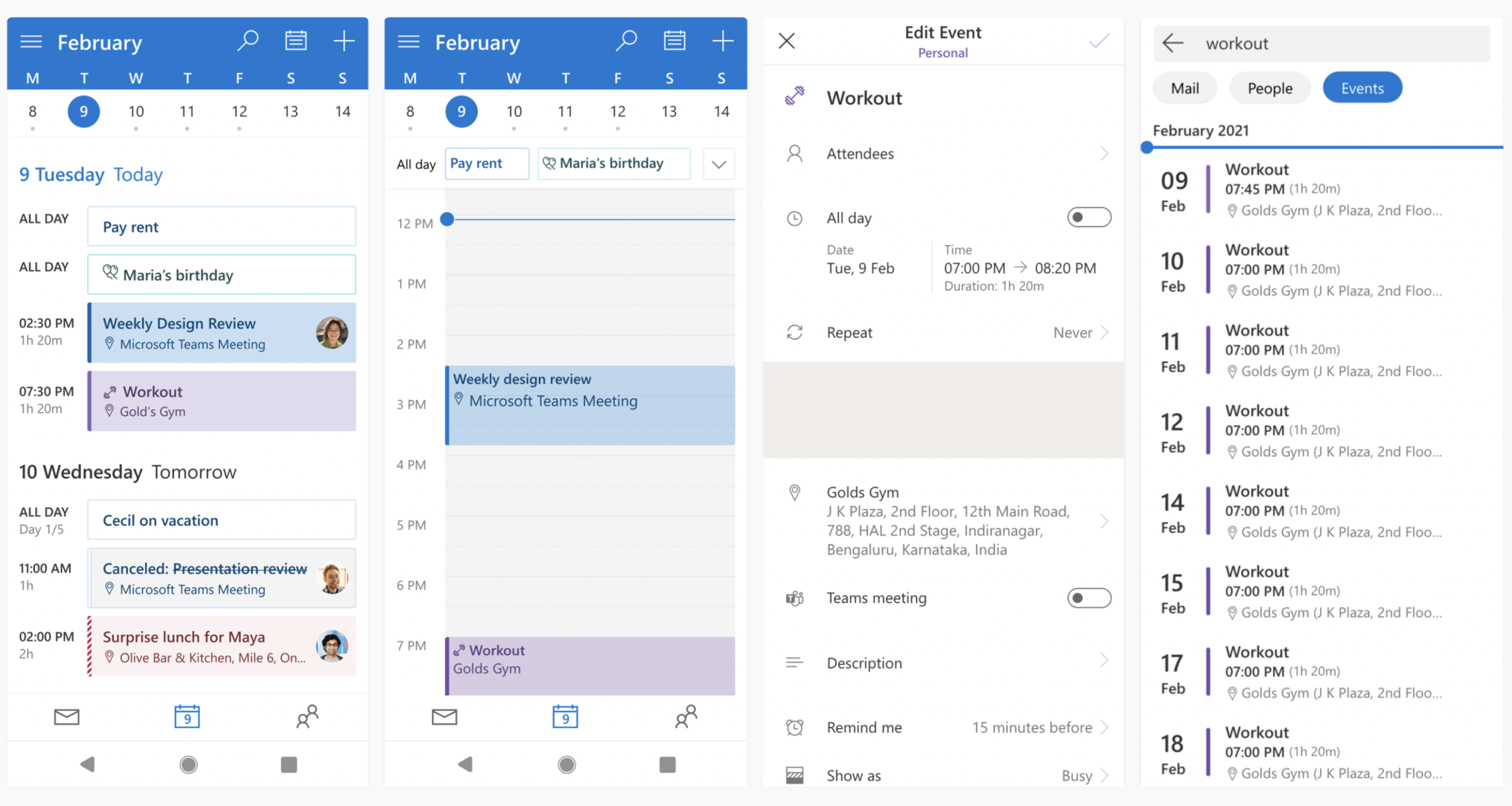
Calendar key screens: Then
Key Calendar Screens: Now
Event details screen by Arnav Sameer & Davis John and calendar search by Oishee Sen.
Calendar efforts I focused on
1/ Envisioning calendar
We wanted to ensure that the redesigned calendar wasn’t just a modernised version of the existing one, but also catered to unmet time management user needs.
I drove a 3-day workshop with a small cross-functional team to identify jobs to be done statements for time management for a user on–the–go.
We shortlisted user jobs best suited to be solved in the Outlook ecosystem. The exercise helped create a long-term roadmap for calendar and early concepts that are foundation to features being built today.
2 / Agenda View
A large section of our user base is made up of consumer users, with typically sparse calendars. The new agenda view collapses empty time and helps people see more of their upcoming events.
The new event cards, day separators and ‘upcoming’ and ‘now’ markers enable easy scanning for when the user is on the move.
98% of consumer users stuck to this view. And an unexpected majority (84%) of our enterprise users also frequented this view.
3/ Day view
The Day view is essential for its accurate representation of a person’s time. A minute is represented per pixel–row on this grid and conflicts are highlighted.
We also solved for a busy all–day tray by employing dynamic event cards that resize to show at least 2 events and a count for the hidden ones.
4/ time management from Inbox (2021)
Users spend most time in the Mail tab. To help them never miss a meeting or reminder, we introduced the ‘Upcoming event’ card in the Inbox.
We also introduced the RSVP event components to email invites. This helps users triage their email as well as calendar invites in a seamless manner without moving away from the Inbox.


